Mailing List Sign-Up Form Requirements

Canada’s anti-spam legislation (CASL) has been in effect for a couple of weeks now, and there is still a lot of confusion out there about what businesses need to do to comply with the new law. One of the most common ways that companies use to organically grow their mailing lists is to put a sign-up form on the websites.  These are often found in sidebars, footers, or popup windows (which seem more and more common these days).

Modal Sign-Up Form

This week, on more than one occasion, I have come across blog posts advising website owners that their sign-up forms need to be modified to include addition information such as:

  • A clear indication of what the recipient will receive
  • The sender’s name
  • The mailing address, plus one of either an e-mail address, telephone number or website address for the sender
  • An indication that you can unsubscribe at any time


This afternoon, I gave the Canadian Radio-television and Telecommunications Commission, the CRTC, a call to clarify this requirement.  My particular interest was in the requirement to include and sender’s name and contact information in the form.

Sergio, who answered the CRTC’s inquiries line, informed me that this was not required on the sign-up forms.  This information is, however, required in each of the commercial electronic messages that is sent to the mailing list.

This is a relief.  It will allow for a little less clutter on web forms!


Being Social – My Experience with Grasshopper

I’ve attended many seminars, and read lots of articles over the past years about how to properly promote a brand and build a community using social media.

One of the core behaviours in social media is to be…. social. Using your social media platform as another channel through which to push out ads for your latest product or sale just doesn’t cut it. It isn’t authentic, and it isn’t social. As a brand, you need to interact with your followers. Engage is a conversation.

That’s why checking my mail (the paper kind, that’s delivered to your door) this morning put me in such a good mood. In the mail I found an envelope that looked like it contained a card, and had my name and address handwritten on it. Ok…. I was interested. Most mail I receive these days is either junk or bills.

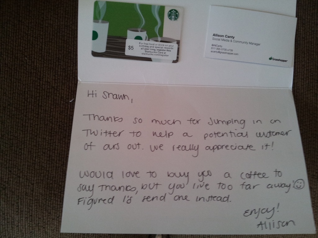
Still standing at the mailbox, I opened the envelope, and found enclosed a thank you card and a $5 Starbucks gift card from Allison, who works in social media at Grasshopper, the virtual phone system that I use for part of our business. Sweet!

Thank you Card from Grasshopper

What did I do to deserve this? Did I sign up for a new account? Nope. Had I suffered a service outage and this was their way of apologizing? Nope!

All it took was a simple tweet. A fellow user on Twitter was asking if anyone outside the United States was using Grasshopper for their phone services. I chimed in that I was using their services here in Canada.

Here’s the conversation:

This is the kind of social media interaction that I imagine would make Scott Stratten smile. Don’t get that reference? Read his books. Trust me.

Why was this little token of Grasshopper’s appreciation so awesome?

1. It was unexpected. They hadn’t contacted me and said “we’d like to send you something”. It just showed up. I assume they either google’d me or looked in their customer database for my address.

2. This wasn’t about customer acquisition. They’re already charging my credit card every month. I’m already a happy customer.

3. There was a nice handwritten note. There’s something so much more personal about a handwritten note compared to received a typed letter.

Back to the promoting a brand and building a community. This little thank you from Grasshopper has inspired me to write a blog post, which I will now share with my social network. I’m also likely going to tell others about this in person over the coming days and weeks. So Grasshopper wins. My input felt appreciated, and I get a nice thank you in return. I win.

It’s been a long week. I’m going to enjoy that coffee. In fact, I’m writing this post from Starbucks right now.

Have a great weekend!

Ottawa Celebrates the Launch of Canada’s First Open Device Lab

Yesterday afternoon I had the pleasure of attending the launch party for Canada’s first open device lab. Opened by Ottawa-based digital creative agency bv02, the Ottawa Open Device Lab allows you to test how a web page will appear on a variety of different mobile phones, tablets and other devices.

One of the largest hurdles in developing web sites targeted at mobile devices the ability to test them properly. Need to be able to see exactly how a site will function on an iPhone 4, Kindle Fire, Blackberry Bold 990, or an old Ericsson Xperia X10a? For many web development agencies, the solution has been to build a collections of mobile devices, old and new. This can be an long and expensive task. This is where the Open Device lab comes in. It makes a variety of devices available to the community so that they can test their sites without having to buy each and every device. They currently have 30 devices available, so far. Many of the devices come from bv02’s own collection, but some have also been donated by local individuals and organizations.

How does the lab work? First of all, the best part, it’s FREE! You contact the lab and schedule a time to use it. Now for the cool part, when you get to the lab, all you have to do is enter a website address on their PC, and the page is automatically pushed out to the plethora of devices available. That’s it. You don’t have to enter the address on each and every device. It’s all done for you. This was my biggest surprise during yesterday’s demo by Brandon Brule, who appeared just as excited showing this off for the 100th time as he did the first!

A huge thank you to Andrew and the entire team and bv02 for the launch party yesterday, and for opening this lab. I predict it will be incredibly popular. There is no question, we’ll be making use of it!

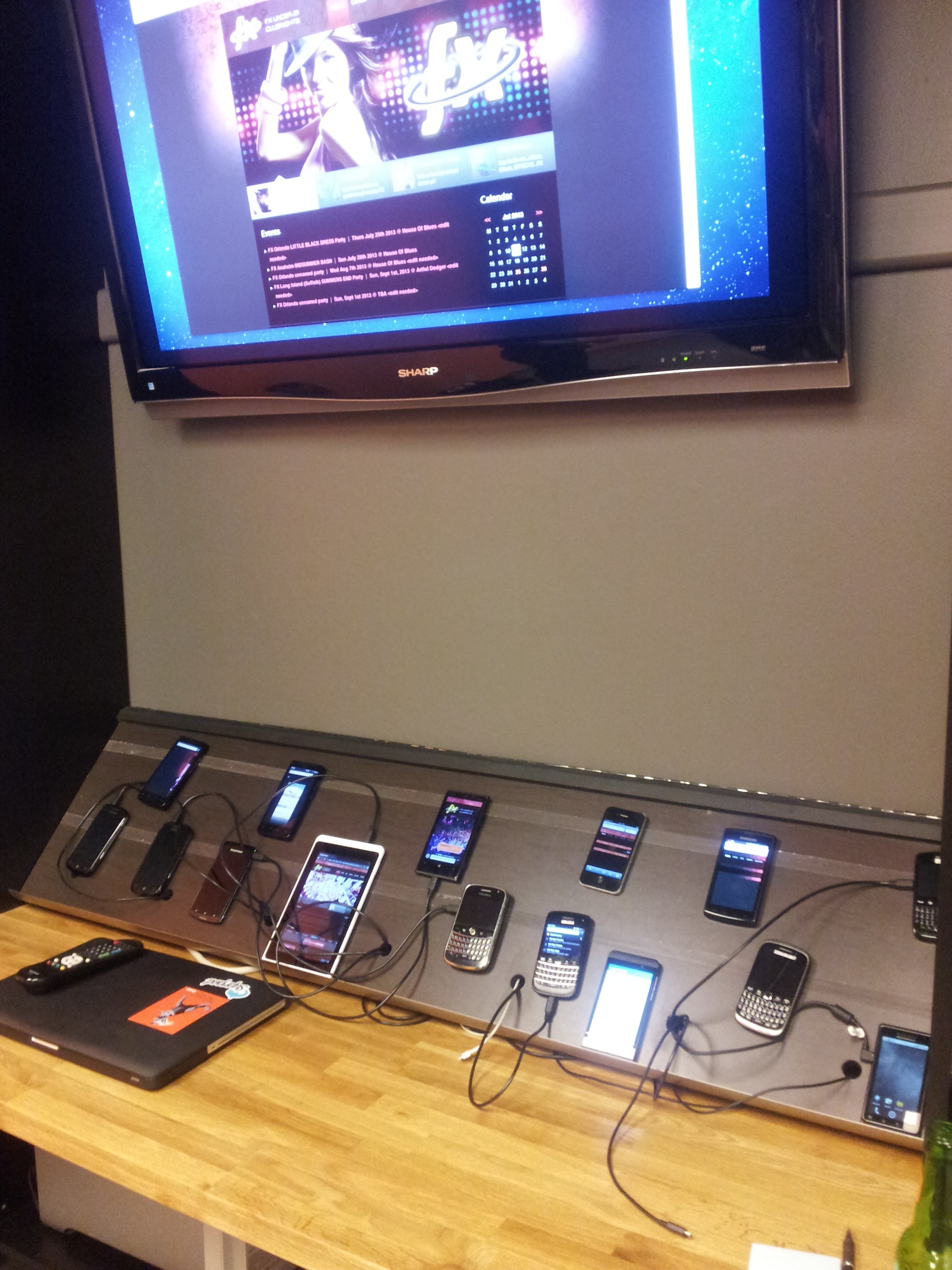
Here’s a quick shot of some of the devices in the lab:

Ottawa Open Device Lab

Here’s some of the reactions from the opening party:

Previewing Responsive Layouts using the Web Developer Toolbar

The “Web Developer” toolbar extension for the Mozilla Firefox and Google Chrome browsers has long been an essential tool of mine while working on any web project. Every once and I while I come across a new feature that endears this product to me once again.

While developing the new Fivesense Technologies website, I discovered that the Web Developer Toolbar, under the Resize menu, can show you a preview of what the current page would look like on various common device sizes, using your CSS media queries to adjust the layout of the page.

Image of the Web Developer Toolbar with the Resize menu expanded.

At the time of this writing, this feature will preview your page in the following layouts:

  • Mobile portrait (320 x 480)
  • Mobile landscape (480 x 320)
  • Small tablet portrait (600 x 800)
  • Small tablet landscape (800 x 600)
  • Tablet portrait (768 x 1024)
  • Tablet landscape (1024 x 768)

If you’re not already using the Web Developer add-on, you can download it here: