
Previewing Responsive Layouts using the Web Developer Toolbar
Posted on: March 21, 2013
The “Web Developer” toolbar extension for the Mozilla Firefox and Google Chrome browsers has long been an essential tool of mine while working on any web project. Every once and I while I come across a new feature that endears this product to me once again.
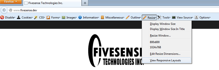
While developing the new Fivesense Technologies website, I discovered that the Web Developer Toolbar, under the Resize menu, can show you a preview of what the current page would look like on various common device sizes, using your CSS media queries to adjust the layout of the page.
At the time of this writing, this feature will preview your page in the following layouts:
- Mobile portrait (320 x 480)
- Mobile landscape (480 x 320)
- Small tablet portrait (600 x 800)
- Small tablet landscape (800 x 600)
- Tablet portrait (768 x 1024)
- Tablet landscape (1024 x 768)
If you’re not already using the Web Developer add-on, you can download it here:
Leave a Reply